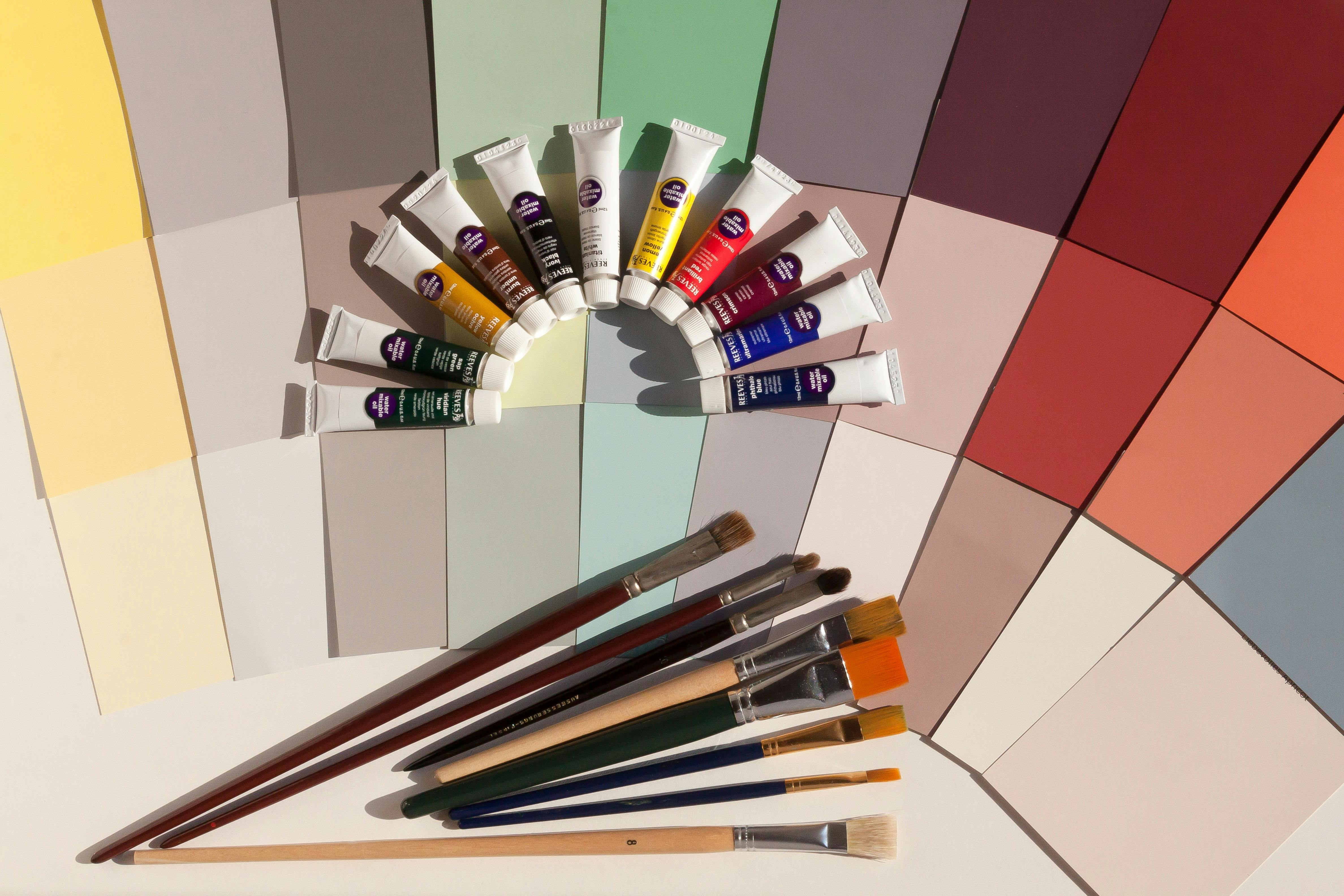
The Art of Limited Color Palettes
There is a certain kind of quiet in artwork that feels expensive. It holds itself with calm authority, the way a well-designed room does—where nothing is excessive, nothing is accidental, and every element seems to have been placed with care.
In a world where digital screens constantly flood our eyes with saturated color, a restrained palette feels almost like a pause. A breath. It feels edited. And that editing is precisely what gives it sophistication.
Many artists begin their journey believing that richness is created through abundance. More colors must surely mean more depth, more beauty, more life. But visual richness is rarely a matter of quantity. The most powerful palettes are not those that display everything available, but those that understand what to leave out.
A limited color palette is a deliberate decision to create a visual world with rules. It is a small vocabulary that must carry a large emotional weight. And like poetry, it works not because it says everything, but because it refuses to waste a word. This is why limited palettes look premium.
Luxury is never chaotic. Luxury is designed to feel effortless, even though it is the result of intense refinement. The same logic exists in art. When your colors are restrained, the artwork feels unified. The eye does not fight its way through competing hues. It moves smoothly, almost instinctively, because everything belongs to the same atmosphere.
This harmony is one of the oldest secrets of painting. Look at Vermeer, whose work still feels startlingly modern. His palette is not loud, yet his paintings glow. Soft blues, warm yellows, muted browns—colors that do not compete. His work reminds us that refinement is not about brightness, but about balance. Light itself becomes the main character, and color becomes its companion.
A limited palette also carries a psychological effect that artists often underestimate: restraint signals confidence. An artwork overflowing with color can sometimes feel like it is trying to prove its worth. But a disciplined palette feels like someone who already knows what matters. It does not try to impress.
This is the same reason some of the most iconic advertisements in the world feel powerful. Consider Apple’s product campaigns. They rarely use a carnival of colors. They rely on whites, greys, blacks, and one carefully chosen accent. The palette is quiet, almost invisible. Yet it creates authority. It tells the viewer: the product does not need decoration. It is enough. That message is not only good design—it is visual persuasion.
In fact, advertising has always understood what artists sometimes forget: too much information weakens desire. A Chanel advertisement often feels like a painting in a gallery—controlled tones, clean typography, empty space used like silence in music. The product sits like a single jewel, and the palette ensures that nothing distracts from it.
A limited palette does something even more important: it strengthens composition. When you remove the possibility of endless color choices, your eye begins to focus on structure. Shape becomes clearer. Negative space becomes meaningful. Rhythm and balance become unavoidable concerns. In this way, a limited palette forces an artist to become deliberate. It strips away decoration and reveals design.
This is why Henri Matisse’s cut-outs feel so alive. His work is full of movement and joy, yet it is rarely complicated in color. He used bold shapes and carefully chosen hues, repeating them like a visual melody. Matisse understood that color is not something you add to a drawing. Color is something you compose with. It can behave like music, like architecture, like pattern. When controlled, it becomes more expressive than detail.
Even artists known for emotional intensity have relied on restricted palettes to create impact. Picasso’s Blue Period is not simply a collection of paintings—it is a lesson in how color becomes narrative. The blues create a mood before the viewer even understands the subject. The palette becomes the emotional atmosphere, the same way a film soundtrack sets the tone before a character speaks.
Mark Rothko pushed this even further. His canvases often contain only a few blocks of color, yet they feel immense. A single hue, when given enough space, becomes a world of its own. His work proves that sometimes the most powerful color is the one you allow to breathe.
Contemporary art continues to prove the same point. Olafur Eliasson’s installations often rely on a single dominant color temperature—golden yellows, pale blues, foggy whites—yet they feel monumental. In works like The Weather Project, he uses restrained tones to build an emotional environment rather than a decorative spectacle. And that is perhaps the most luxurious effect of all: when color stops being an accessory and becomes an experience.
If art history teaches us discipline, branding teaches us memory. Some of the most famous brands in the world are built on limited palettes because recognition depends on simplicity. Coca-Cola’s red is not merely a design choice; it is a signature. Tiffany’s blue is not simply a pleasant shade; it has become a cultural symbol for luxury itself. These brands demonstrate how limited palettes become identity. When a color is repeated with consistency, it stops being just a color. It becomes a feeling.
This is exactly what happens when an artist develops a controlled palette. Over time, the viewer begins to recognise not only your style, but your atmosphere. Your work begins to feel like it belongs to one world. And that consistency is one of the strongest markers of professional maturity.
But the true secret behind an expensive-looking palette is not just the hue. It is value. Value refers to how light or dark a color is. Many artists chase beautiful shades but forget that value is what creates depth. A palette can contain only three colors, but if those colors include a clear light, a strong mid-tone, and a deep dark, the artwork will feel structured and dimensional. If all colors sit in the same value range, the work becomes flat and visually uncertain, no matter how aesthetically pleasing the hues may be.
This is why black-and-white photography often feels luxurious. It proves that drama and elegance can exist without hue. It is also why charcoal drawings can feel more powerful than colorful sketches. They rely entirely on value control. A simple rule applies here: if your artwork works in greyscale, it will almost always work in color.
Building a limited palette is not about randomly selecting fewer colors. It is about creating a deliberate system. Some artists start with neutrals—off-white, warm grey, sepia, charcoal—and introduce one hero color as an accent. This approach instantly feels sophisticated because it mirrors editorial design. Others build palettes from nature, which is perhaps the most reliable teacher of harmony. Nature rarely uses chaotic color combinations. It repeats families of hues, softened by light and atmosphere. The monsoon sky, a coastal landscape, a street corner at dusk—these are all naturally curated palettes waiting to be borrowed.
Of course, restraint requires discipline. The most common mistake artists make is breaking their own rules. Too many accent colors can weaken hierarchy. Overusing saturation can make a palette feel loud instead of premium. Adding too many similar shades can make the work feel indecisive rather than rich. Luxury palettes do not rely on variety; they rely on clarity.
Practicing limited palettes is one of the strongest exercises an artist can do. Repainting an old artwork using only three colors can reveal what was essential and what was merely decorative. Extracting five colors from a photograph can teach natural harmony. Designing with black plus one color can sharpen compositional thinking. These exercises are not restrictive—they are liberating, because they train the eye to see what truly matters.
A limited palette refines creativity. It makes an artist more intentional, more controlled, and more aware of visual storytelling. It teaches you to build mood with fewer tools, to guide attention with subtlety, and to let space and silence play their role.
In the end, the most premium-looking art is rarely the one with the most colors. It is the one where every color has a purpose. Restraint becomes a signature. A limited palette becomes a kind of visual elegance.
Because when an artist uses fewer colors and still creates depth, the viewer understands something instantly.
This is control.
And control—whether in painting, illustration, or advertising—will always look expensive.